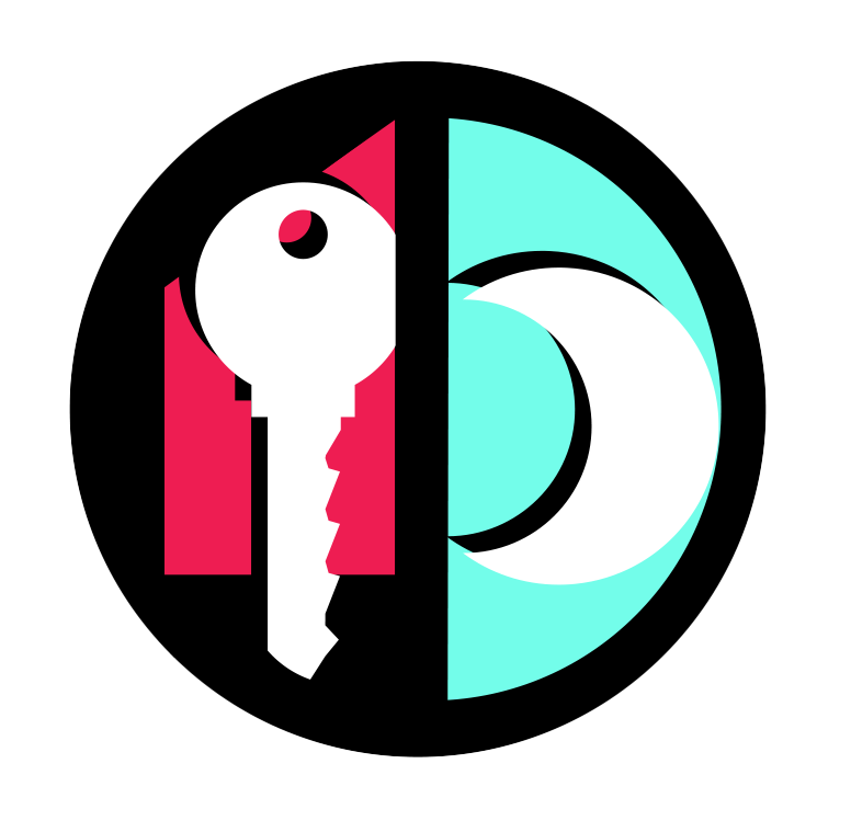
While I was pursuing my MS in Mass Communications at San Jose State, I was attending night school to pick up a certificate in Commercial Art & Graphic Design. I learned quite a bit about brand development and logo design, but never produced something I felt worthy of public consumption until now.
There is a lot of symbolism packed into this logo. It’s the result of several ideas I had swirling around in my head. I’d attempted to sketch it out on paper first, but really couldn’t translate my thoughts into design until I had my laptop open and the right music playing in the background.
My initials DD are represented on the right; one is the inner curve of the crescent moon, and the other is the larger curve of the light blue field. A second set of D’s was spotted circling the logo with one facing west and both D’s sharing a center spine.
The red house shape on the left is inspired by The Johnston House, the most iconic historic home on the coast. The color might also suggest a barn to some; the Coastside has deep agrarian roots.
At first glance the key appears to be a fairly standard element in real estate advertising, but look closely and you’ll see the teeth are shaped like a set of waves.
The shape is optimized to fit a social media profile picture, an Instagram button, an app icon; the possibilities are numerous!
Would you like a piece of logo swag? I’m still figuring out what to offer! At the top of my list are keychains, magnets, buttons, and pens. I’d be happy to send you something!

 Facebook
 X
X
 Pinterest
 Copy Link